Milestone 2
Formative Study and Refined Concept
Introduction
After milestone 1 we had decided to focus on grocery shoppers and helping them spend less time searching for items. We decided to focus on younger shoppers in their 20’s and 30’s, but still had some unanswered questions. Should we target lone shoppers, or people who shop in pairs or with their family? Should we focus our design to integrate with a cart, a basket, or both?
We had also thought of several ideas for how to direct shoppers through a grocery store. They relied on a variety of input methods like pulling items from a shopping list or letting users speak to a device for help. However, they all focused on providing users with turn-by-turn navigation for one item at a time.
We wanted to use this study to see if turn-by-turn navigation was something users would like to use, or if there is a better way to help users shop more efficiently. The data we collected in this milestone helped us find a new, better direction to head in, and we propose three new ideas we plan to study further.
Study Design
Our study had two main research questions in mind:
- How do people move through grocery stores?
- How do shoppers find their groceries in the store?
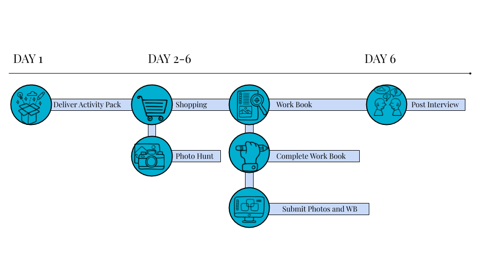
Our study used a cultural probe and semi-structured follow-up interviews with each participant once they had completed all the activities in the probe. We felt that a cultural probe was the best choice given that we were interested in learning about people’s attitudes and behaviors when they grocery shop. A diary study focusing on grocery shopping trips would take too long to generate enough data because trips can happen about 1-2 weeks apart. With a cultural probe, we were able to learn much more about a single shopping trip.
In total, we recruited four (4) participants. There were 3 males and 1 female with an age range of 22-28.
- One is employed full-time
- Two are full-time undergraduate students at Schoolcraft College and the University of Michigan
- One is full-time graduate student at School of Information and working part-time as a research assistant
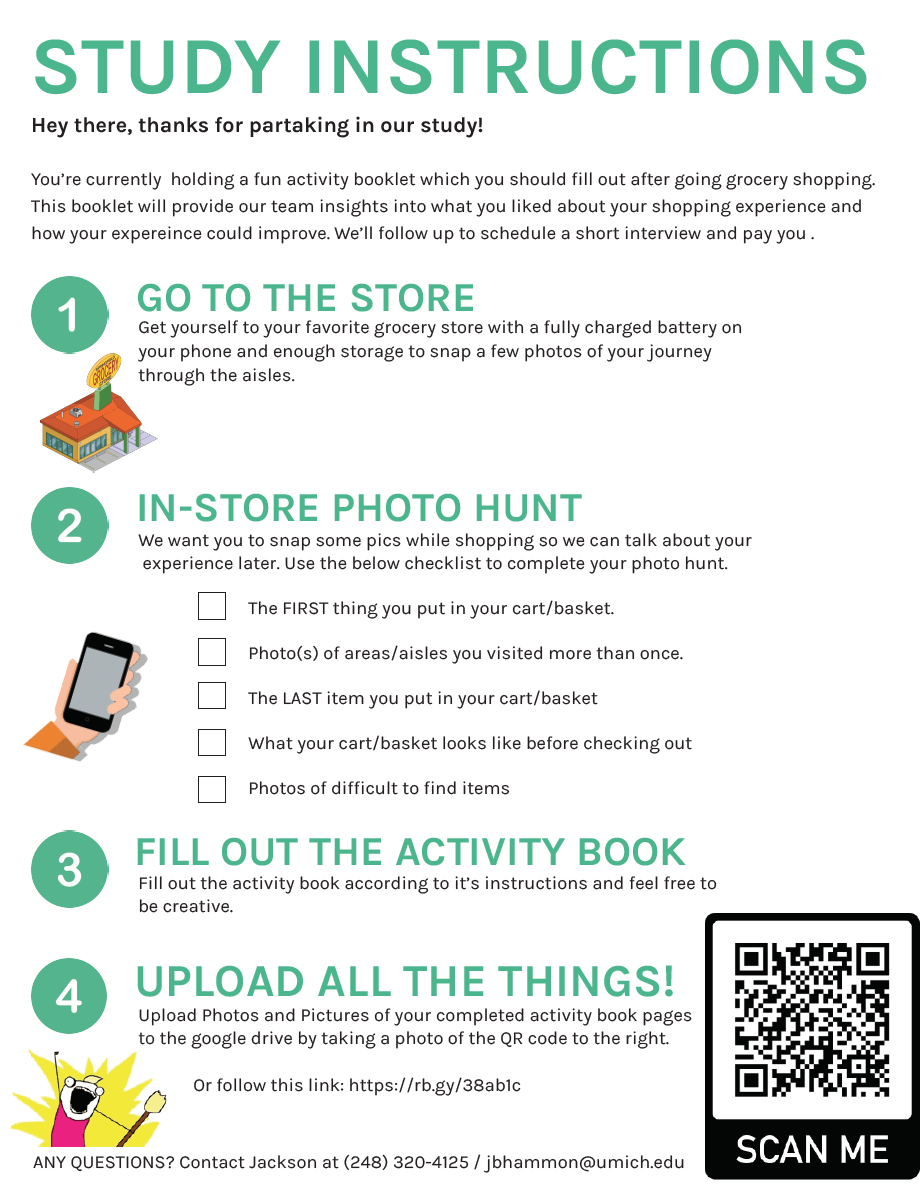
he cultural probe consisted of two parts: creating a short photo journal, and completing an activity booklet. We asked participants to complete the photo journal on their next grocery shopping trip. They were asked to photograph five things for us:
- The first item they put into their cart/basket
- Photo(s) of areas or aisles they visited more than once
- The last item they put into their cart/basket
- What their cart/basket looked like before they checked out
- Items that were difficult to find
Once they completed their shopping trip the participants were to complete the second half of the cultural probe, which was a short activity booklet to help them reflect on their trip. First, they were given a blank space to draw a map of the store they visited, and then we asked them to add to it their path through the store and where they picked up each item they bought. Last, we asked them to list the items they bought, and four pros and four cons about their trip.
Page 1
We used the follow-up interview to get a better understanding of each participant’s pictures and drawings from their activity book. Additionally, we focused on participant’s general behaviors and habits when they grocery shop. We wanted to know things like how they search for items they can’t find, and if they have a usual path through their store of choice.
Study Results
To begin our analysis our team shared the notes and insights we gathered from each of the follow-up interviews we had conducted individually. The shoppers visited several different stores: Trader Joe’s, Kroger, Meijer, and Costco. After talking through trends and similarities in the data we started to use sticky notes to organize and keep track of each data point. However, shortly after beginning we realized that many data points were pointing away from our Milestone 1 ideas. We heard from many participants that finding items in the store was not something they struggled with doing:
“I usually buy the same items on Kroger, so I remember where they are.”
“I would ask an employee for help if I cannot find something.”
“I’ll ask for help, but usually for things that aren’t groceries.”
“I only visit aisles for exactly what I need...that’s why I’m at the store.”
Shoppers we spoke to buy many of the same things on each trip, don’t feel it’s a big hassle when they can’t find something, and are either comfortable asking for directions or okay giving up if they can’t find something. Participants mentioned they had visited more than one grocery store on the same day, but it was always because they searched for different items at different stores. We didn’t hear that someone would drive to a second store because they couldn’t find an item at the first store.
The map we asked participants to draw and label was the most valuable part of our cultural probe. It helped reinforced what participants said about their typical path through stores. Many people typically followed a path around the edge of the store, and ventured into the aisles they needed things from.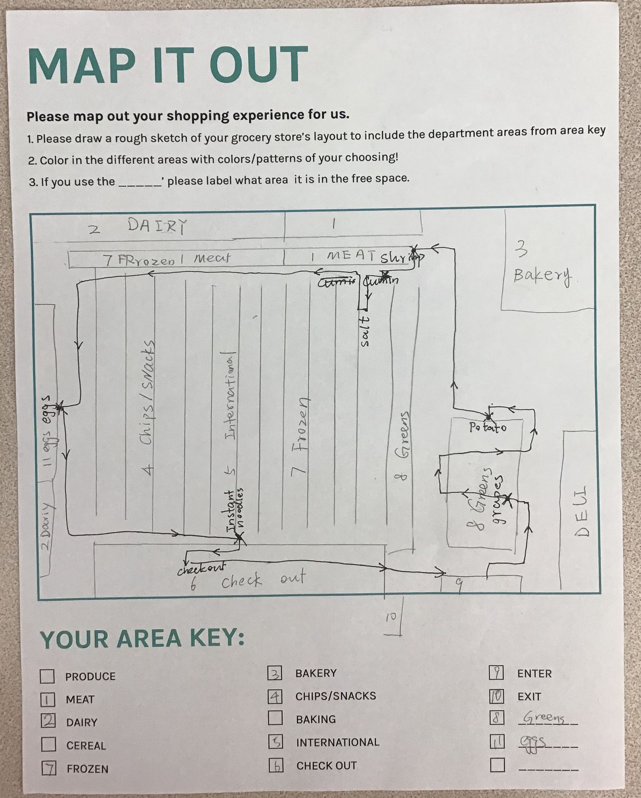 This helped us realize shoppers usually follow the same general path, and the specific deviations are dictated by their shopping list. This realization helped to start our pivot from our Milestone 1 ideas to our newer direction.
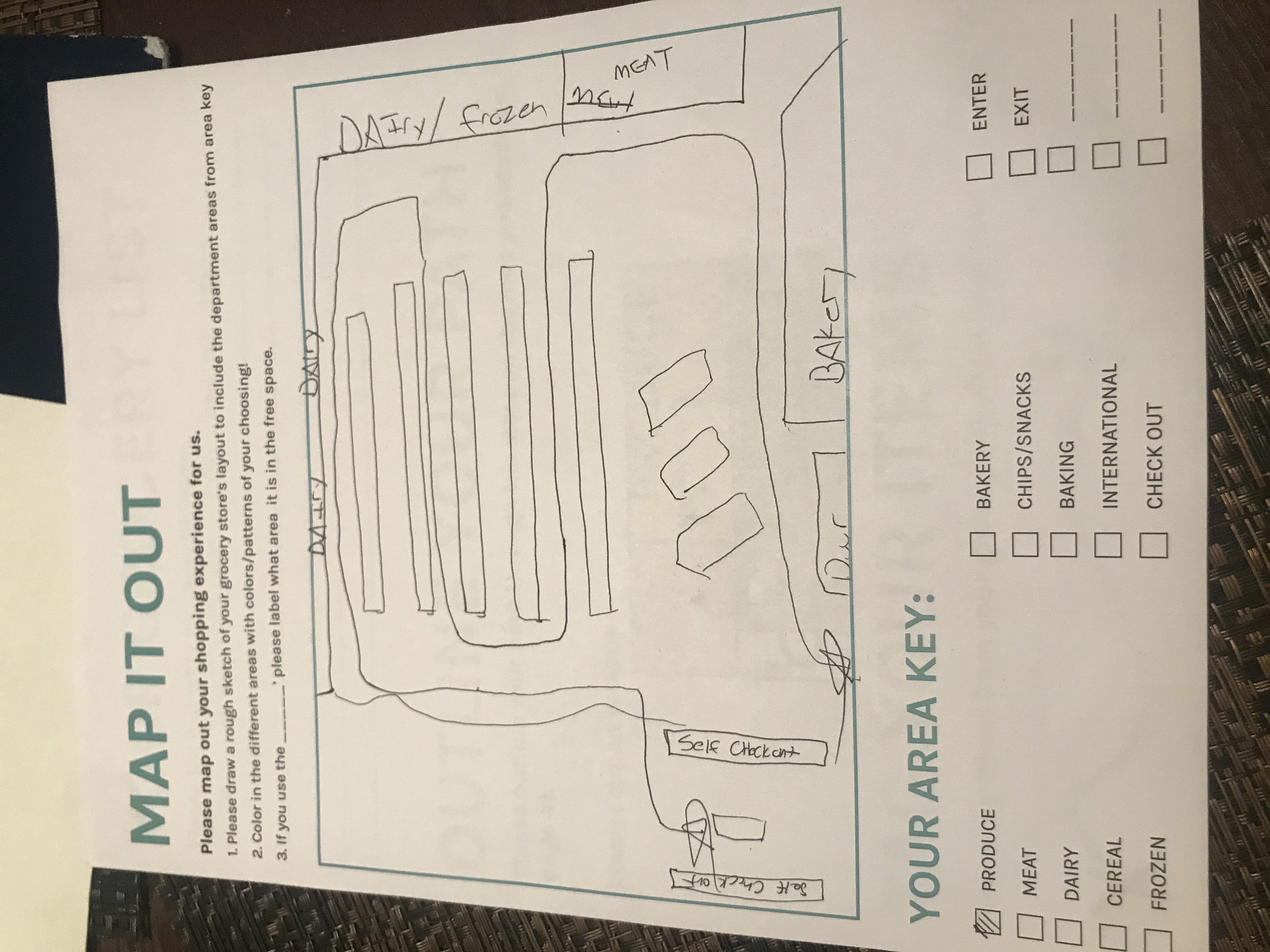
Overall, these results helped to better define our target audience and shift the direction of our design. Rather than a turn-by-turn GPS-like system, we’re focusing on showing shoppers where items on their list are as they move through stores. Whether our design should focus mainly on adding hardware to shopping carts or on a mobile app remains unanswered.
Ideation and Selection
After we realized we needed to head in a new direction we started to brainstorm and generate more ideas. We tried to consider ideas that included our findings from Milestone 1 and 2, as well as ideas that just focused on what we heard in our interviews from this study. Some of our new ideas included:
- App to check if shopping list items are out of stock
- AR phone app to highlight shopping list items in the store
- Personalized AI guidance through the store
- Voice-activated store navigation
- Cart with a screen that shows every item that’s down/in an aisle
- Image recognition/barcode scanner on a cart that can cross items off your list for you
- Giving user directions with: screen, lights, light up arrows, etc.
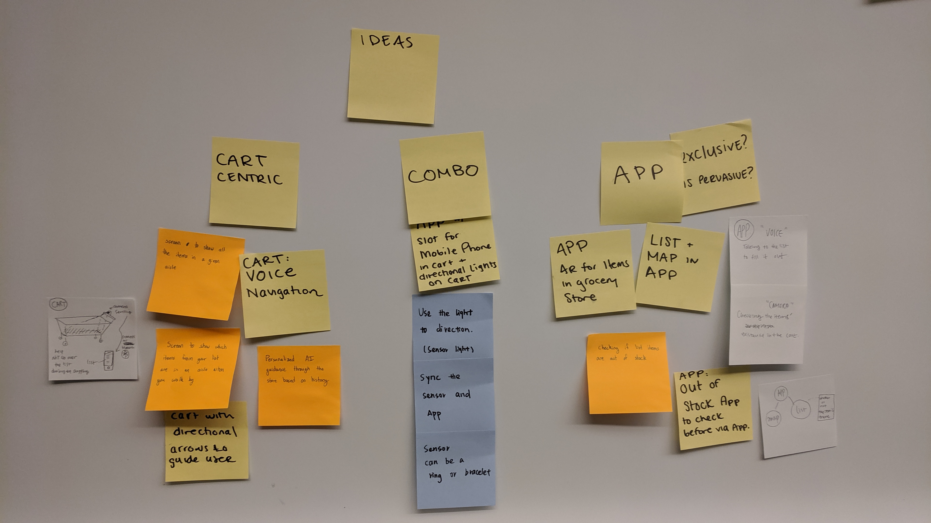
After generating another round of ideas we discussed a set of criteria and a set of tradeoffs we would evaluate them against.
Criteria
- Plausibility - Is the idea possible for our team to physically prototype?
- Acceptability - Does our idea involve pervasive design ideas?
- Appropriateness - How much input does the idea require from the user?
Tradeoffs
- Whether or not to include a mobile app as part of the design
- Including voice as an alternative input method
- Requiring a smartphone might be easier, but would reduce access
- Using barcode/QR code scanner instead of image recognition
- How an interface (one or two screens) or no interface on shopping cart would change the shopping experience
- Designing for a basket vs for a cart
Our team has a goal to complete a physical prototype of our design this semester, so it’s important to us that we choose a reasonable scope. We also wanted to make sure the ideas we focus on embody the idea of “pervasive computing”. We could probably design a smartphone app to help people shop easier, but that wouldn’t take advantage of pervasive computing. Last, our research showed that design for grocery shopping should probably require minimal input from users. Users don’t need help making a list or following their usual path through a store, so our design will have to integrate with those activities without requiring much extra effort from them in order to seem acceptable.
Refine Scope and Concepts
Until this point, our project scope was still very wide. We had identified the environment and the activity we wanted to augment, shopping at a grocery store, but the intended audience and their interaction method with the device were still undecided. This formative study showed us we should focus on younger, individual shoppers who rely on physical or digital lists when they shop. We identified the time that users spend deciding which aisles to visit as the biggest opportunity for our design to help.
SmartCart
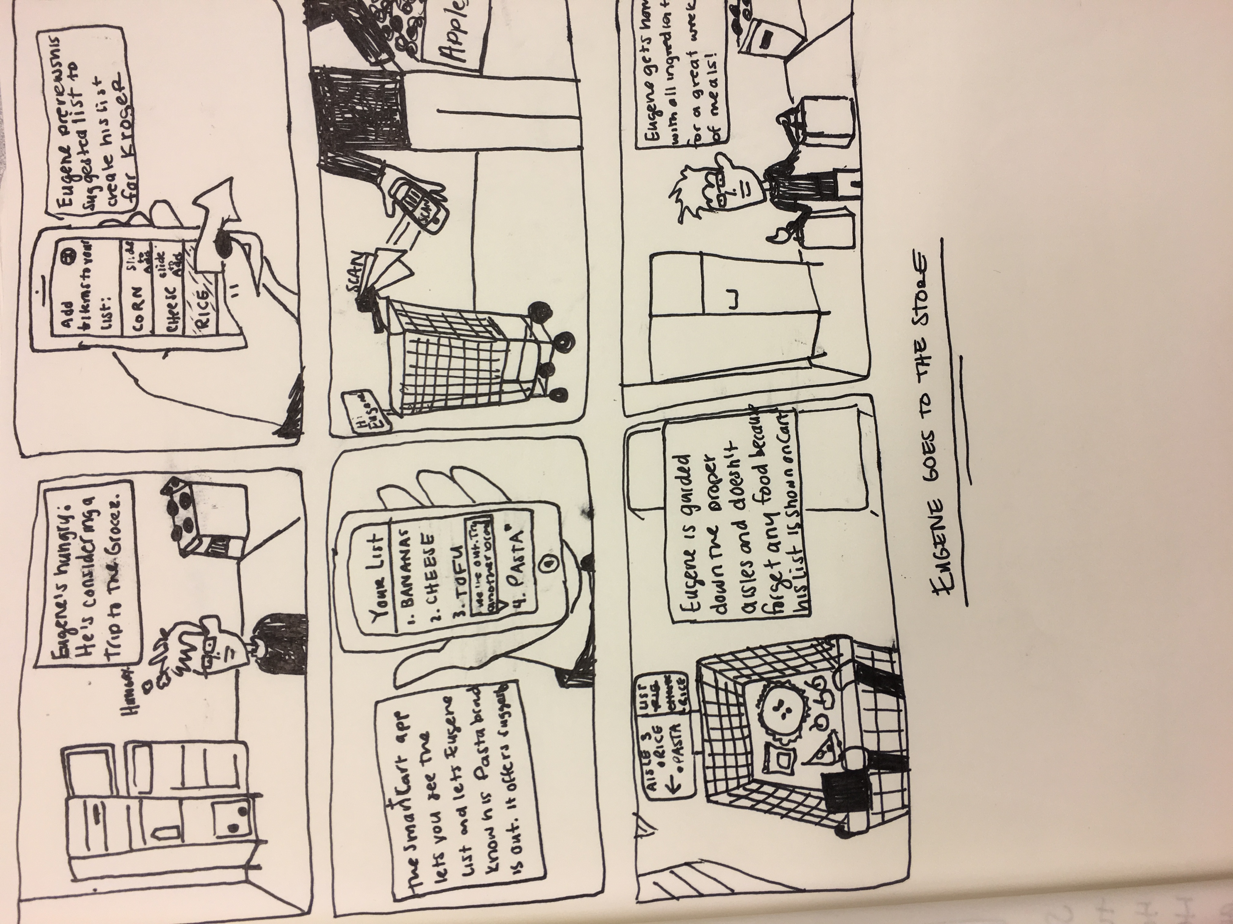
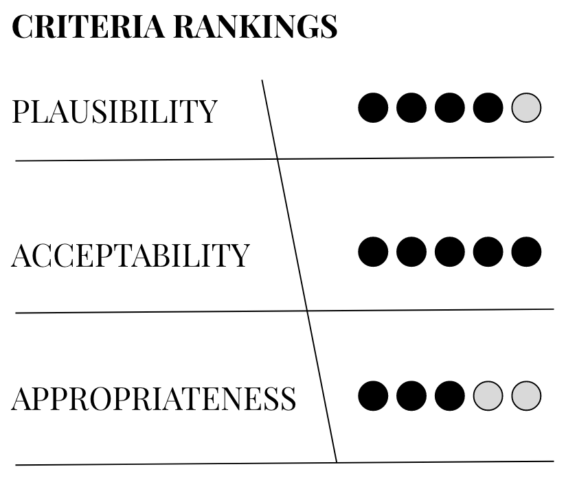 Based off our criteria mentioned above. We decided on a solution that includes a combination of a cart interface along with a mobile application. This mobile application will use AI to recognize a user’s common grocery cart items. We thought this was an important angle to consider because we learned from our interviewees that they have many items that they buy every week or every other week, so called “staples” in their diet. They noted pain points in the shopping experience when they weren’t able to discover whether or not these foods were out of stock, seasonal or in a different location than normal. We thought about plausibility for us as well as the system in the world and we can see this app leveraging existing store data on in/out of stock items to alert users if something is out of stock/discontinued the day they plan to shop as they’re creating a list within the app. The Appropriateness ranking was docked because every time the user would need to shop they would have to update their list or re-confirm the older one in order for the solution to work properly. The interface on the cart will sync with a person’s identifier via a scanner and this seamless integration makes its acceptability ranking high as a “pervasive” and beneficial shopping tool.
Light Cart
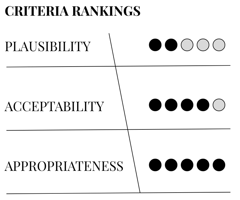 According to our observation, interviews, and feedback from participants, whether to have a navigation tool in-store is not a big problem. Shoppers usually visit several grocery stores that can fit their basic requirements, meaning that they might be familiar with the layout of stores. Since our target audience is young people who prefer to use a digital list, we reach out to an agreement that we can still use a light directional signal in front of the cart direct users where items are in their list based on the input in the mobile application. After all, there is always something new on their list, and some seasonal food will be in a different location than usual.
A light beam could display a direction visually, and attract shoppers to using to some extent. Still, its plausibility is quite low here due to the complexity of transferring information and detecting location. To make this light solution success, shoppers should first sync their digital list in a mobile application with the cart via a QR code. Thus, the light sensor could start to direct the location of the item based on the position of user from nearest to farthest, which makes its acceptability ranking high as a “pervasive” and beneficial navigation tool. The appropriateness rank should be high on this solution because it fits one of the goals: navigation based on the digital list. The light directional signal will give a visual direction to shoppers, so they could easily find the location of items on their list and don’t need to keep looking at the interface.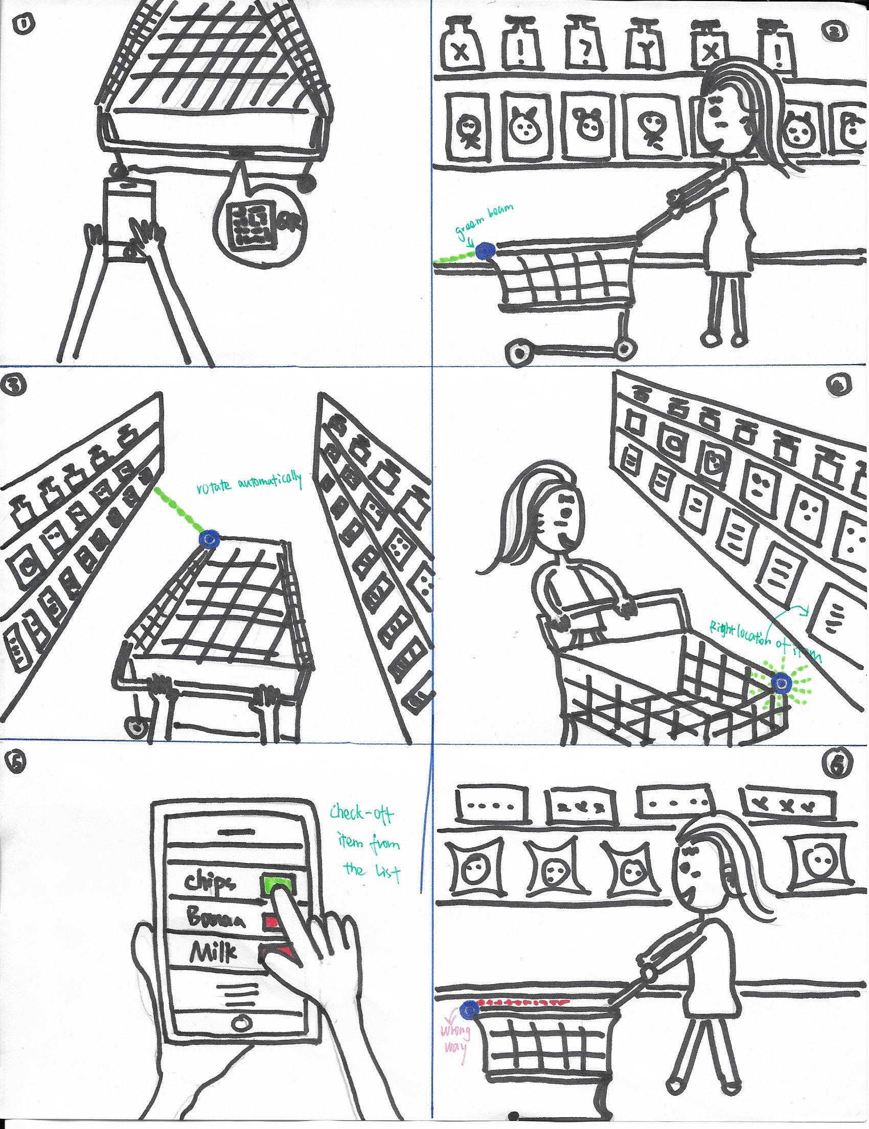
Barcode Scanner
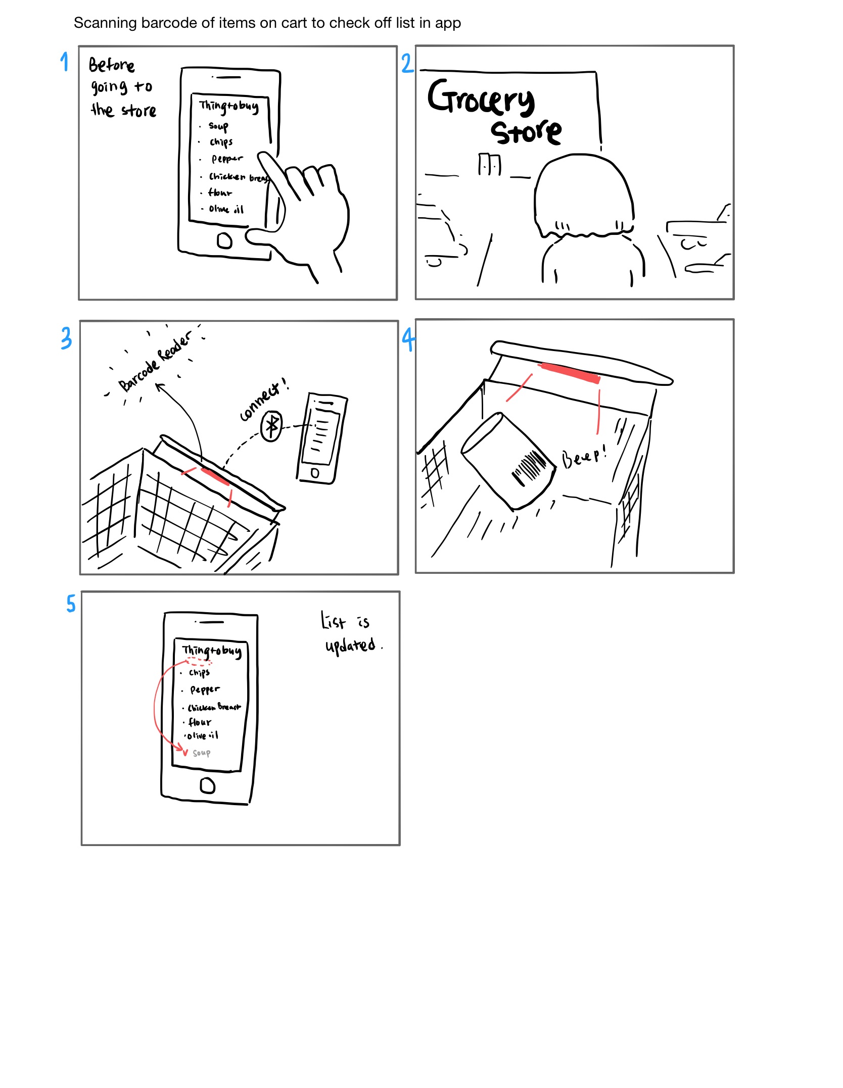
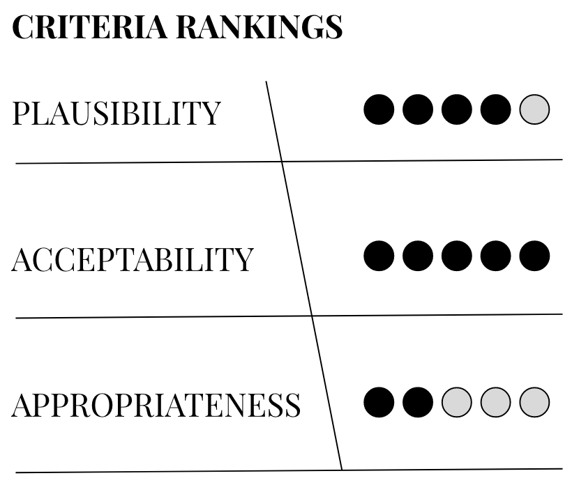 Through the interview after the study, we found people usually make the list in their mind, physically on the paper or digitally in their mobile phones when planning the grocery shopping. With the same concept of combination of a cart and the mobile application, we thought managing the list would help shoppers reduce the time of going over the list while at the store. The idea is that when the shopper puts the item in the cart, the barcode will be read and the list in the mobile application will be updated and show the items that are not in the cart yet first. Its plausibility ranking would be high because reading the barcode of the product and sending those data are already widely used. In addition, since we are focusing on young people as the main target, using the mobile application would not be an obstacle to them, rather it would be economical and acceptable in pervasive perspective. So we put its acceptability ranking high. The appropriateness ranking is low because it requires users to make sync with the cart before they start shopping and to do a little extra work of scanning the barcode of the product when putting it into the cart.
Problems and Opportunities
Relying on users’ lists has pros and cons. Our research shows we can best serve users who shop with lists, but that would require designing ways to import both digital and physical lists. Additionally, we have discussed if voice input should be a part of the design. It would make it more accessible to more users, but would certainly complicate the final design.
A system we can take advantage of is the mobile apps many grocery stores have already created. Stores like Meijer and Kroger have developed their own mobile apps, and integrating our design into an app many are already using for their shopping could reduce friction to adopting a new tool to help shop.
Conclusion
At this point our group is really excited about the new direction we’re design is headed in. We have a couple of ideas on directing users through the aisles we need to explore further, but also still have new questions to explore. How acceptable will users find a technology that relies on their shopping list?
We also weren’t able to decide if our design should rely on a mobile app, hardware solely on grocery carts, or some combination of the two. Further research and experimentation are needed to find an answer.
